I’ve always liked the idea of math, but doing it by hand has been another matter. My mental CPU seems to go to 100% during hand calculation. Hand calculators are good but Python libraries are even better for my quantitative explorations.
Thanks to Python, I’ve managed to build a local, self-hosted solution that can rival Wolfram Alpha or other pricey proprietary packages. Let’s walk through it.
SymPy: Symbolic Math
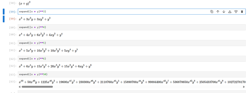
What set Wolfram Alpha apart from conventional calculators when it debuted was that you could give it symbolic computations like you would find in an algebra or calculus textbook and have Wolfram Alpha solve them for you. It seemed like magic. I thought I might like to have my own version I could run on my own PC, but a copy of Wolfram’s Mathematica was prohibitively expensive, even with its personal edition.
That’s why SymPy caught my attention. While packages like Mathematica or Maple can cost hundreds of dollars, SymPy is free. SymPy is also based on Python. Since I already had experience with Python, I could pick up SymPy easily.
SymPy really shines in an interactive mode like IPython or a Jupyter notebook. Being able to receive immediate feedback is exciting.
Even if you mainly work with data like I do, you’re going to hit a wall if you don’t know calculus or linear algebra if you want to read more advanced texts or journal articles in statistics. Being able to work with symbolic math easily has helped my understanding. Even if the vast majority of operations are hidden behind numerical programs, it’s helpful to know the theoretical underpinnings of statistics that these calculations are based on.
NumPy, pandas, SciPy: Stats
Apart from the algebraic calculations, the vast majority of statistical calculations are numeric. They use floating-point decimal operations to approximate values rather than exact values, the way SymPy does.
NumPy is a library for working with numerical arrays. It’s useful for creating multidimensional arrays. A simple list of numbers would be a line. A 2-dimensional array would be like a table, containing rows and columns. In NumPy, arrays are known as axes. This defines a matrix. Since matrix operations are used frequently in linear algebra and linear algebra is used so widely in the sciences, including statistics, this opens up NumPy to a wide variety of applications.
NumPy includes some basic descriptive statistics operations, including the mean, median, and standard deviation. You can perform calculations with these arrays that you would normally have to loop over in a standard Python program. These would be tedious to implement and costly to run in terms of performance.
As useful as NumPy is, I still needed some other libraries for effective statistical work in Python. pandas is a library for operating on tabular data arranged into “DataFrames.” These are similar to how spreadsheets and relational databases arrange data, and Pandas can import this data from popular spreadsheet programs like Excel.
You can view and summarize data from pandas, and even create crosstabs or pivot tables of categorical data. This is handy for doing certain statistical tests like chi-square. It’s easy to add and remove columns, as well as reshape tables when you need to.
SciPy is a grab bag of operations designed for scientific computing, but it includes some useful statistics operations. It has a lot of common probability distributions, including the binomial, normal, and Student’s t you learn about in introductory stats classses.
statsmodels and Pingouin: Regression
During a physics lab, we were doing an experiment. I don’t remember what exactly we did. I think we were measuring the time an object took to fall from a height with a stopwatch. I do remember that we were then shown how to put the data into a spreadsheet and generate a regression. This astonished me. A linear equation generated from the data! This was my introduction to linear regression.
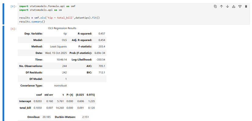
This is an essential tool to understanding relationships in your data. It’s also easy to do in Python. You have several choices of libraries. statsmodels is geared toward statistical analysis and econometrics. It has a bit of a learning curve, but it’s easy to use when you get the hang of it. You can specify regressions based on R formulas, which is a programming language popular in statistics.
Pingouin’s interface is much simpler, but perhaps more limited. It’s great when you’re exploring data and don’t care much about things like correlation coefficients or find the results that statsmodels spits out are intimidating. While you can access this information in pingouin, the presentation is much simpler than statsmodels. The results are organized in a pandas DataFrame that looks like the tables you see reported in a lot of social science journal articles.
I like Pingouin for its simplicity, but statsmodels also has some things in its favor. Besides linear regression, it also has more advanced models like time series analysis. It’s also cross-checked against other statistical packages like R for accuracy. If I ever had to make sure that the results were absolutely reliable, I would reach for statsmodels despite being more difficult to use for this reason.
Matplotlib and Seaborn: Visualization
Another major feature that I wanted to recreate from my old graphing calculator was powerful visualizations. Fortunately, modern monitors are more capable than the old LCD screens on calculators, something that xkcd has also noted despite their expense (You can probably thank TI and standardized tests for that). I’ve found Python to be a more than capable replacement for a graphing calculator.
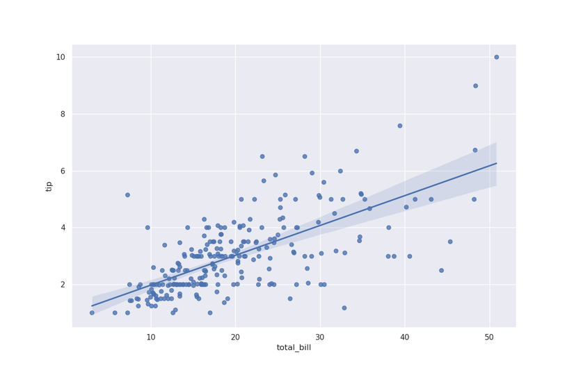
For statistical visualizations in Python, Seaborn is the best one I’ve found so far. The histograms, scatterplots, and regression plots are just pleasing to look at.
With the default theme, Seaborn’s graphics can give ggplot2, popular in the R community’s “tidyverse,” a run for its money.
Visualizations of statistical objects aren’t just for decoration. They’re crucial for understanding data. A histogram tells you how the data is distributed. You can determine at a glance if a distribution is skewed before you run any standard tests.
Matplotlib is another library popular for visualizations. Seaborn is effectively a front-end to Matplotlib. Changing the theme in Seaborn also changes the display of standard Matplotlib plots. Matplotlib can be used for simple line plots to complicated visualizations.
You can use Matplotlib to edit Seaborn plots. You might want to change the labels to remove underscores if you wanted to create a plot to show other people. You might do this for a presentation or an article.
As with statsmodels, Matplotlib does have a learning curve. There are two major interfaces, a low-level “axes” method and a higher-level object-oriented interface. The latter is similar to how you might use a graphing calculator for quick plots. The official documentation encourages use of the axes method.
I can also use SymPy as a graphing calculator to plot functions. This has an advantage in that I don’t have to generate NumPy arrays. I can just type out an equation in the familiar y = mx + b form and have the plot generated. I can just think of it as an equation.
Using Python as a super-calculator has been a great help. It’s given me a lot more things to do, and helped me see the power of using Python and programming languages in general as a way to explore math and statistics. It’s made them easier and less stressful.


