Design principles
Brand expression
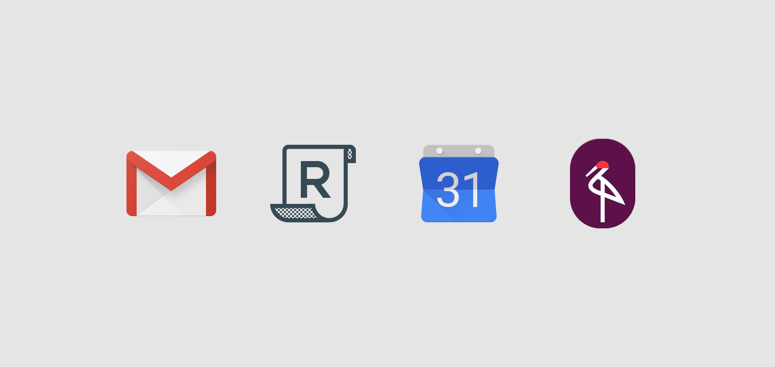
Product icons are the visual expression of a brand and product, including their services and tools. Icons communicate the core idea and intent of a product in a simple, bold, and friendly way. While each icon is visually distinct, all product icons for a brand should be unified through concept and execution.
These guidelines are a starting point to ensure that your product icon colors and key elements reflect your brand identity.
Design approach
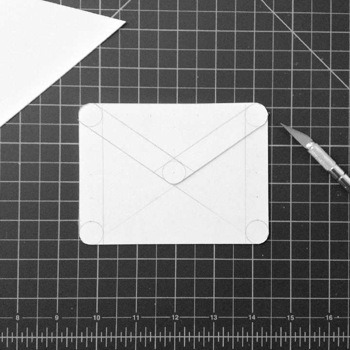
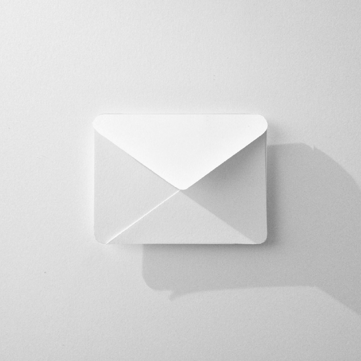
The tactile and physical quality of Material is reflected in the design of Material icons. Each icon is cut, folded, and lit as paper would be, but represented by simple graphic elements. The quality of Material is sturdy, with clean folds and crisp edges. Surfaces interact with light through subtle highlights and consistent shadows.


Grid and keyline shapes
Icon sizes
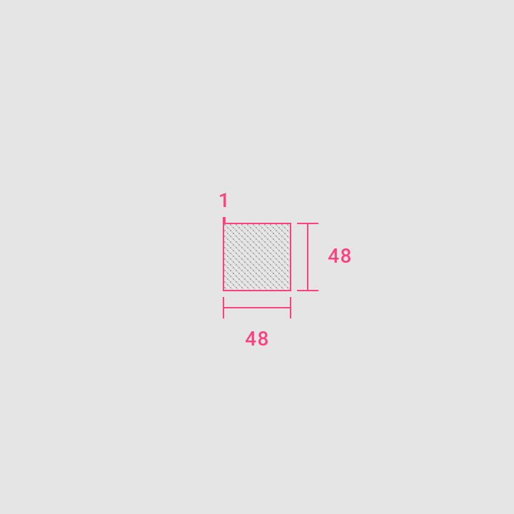
When creating an icon, view and edit it at 400% (192 x 192 dp), which will display edges at 4dp. By maintaining this ratio, any changes to the original will be scaled up or down proportionally, which preserves sharp edges and correct alignment when the scale is returned to 100% (48dp).
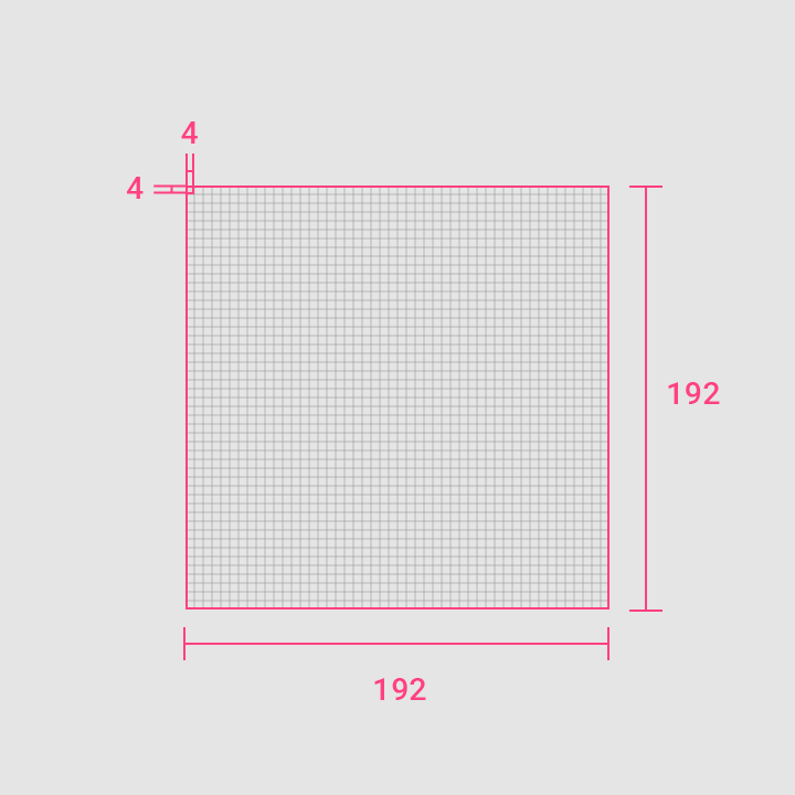
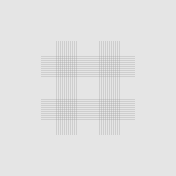
The icon grid establishes clear rules for the consistent, but flexible, positioning of graphic elements.
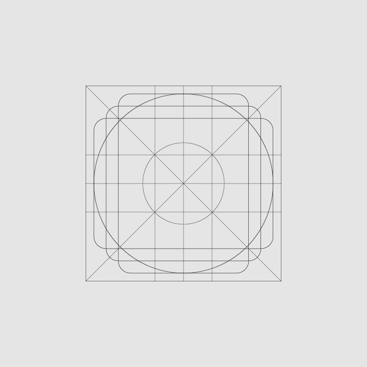
Keyline Shapes
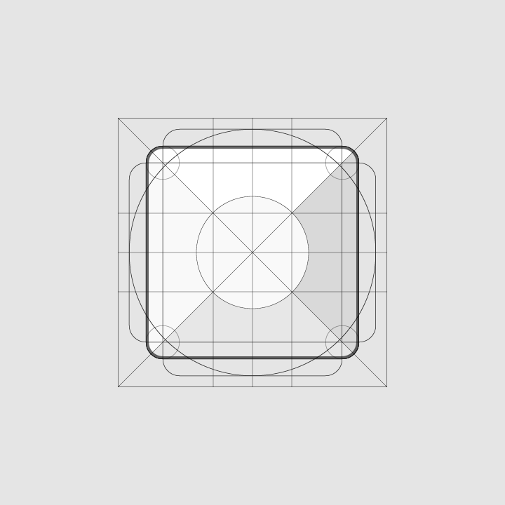
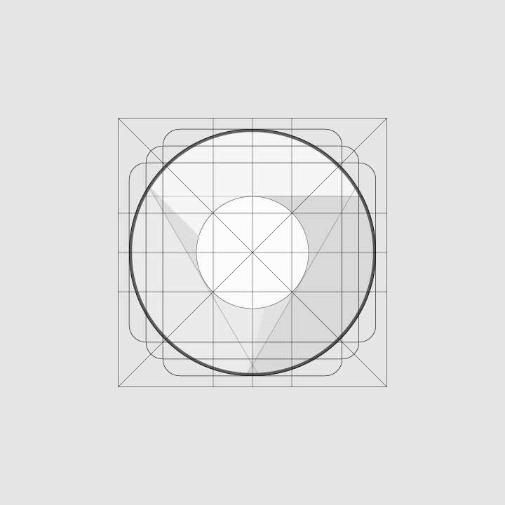
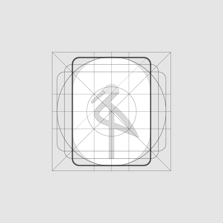
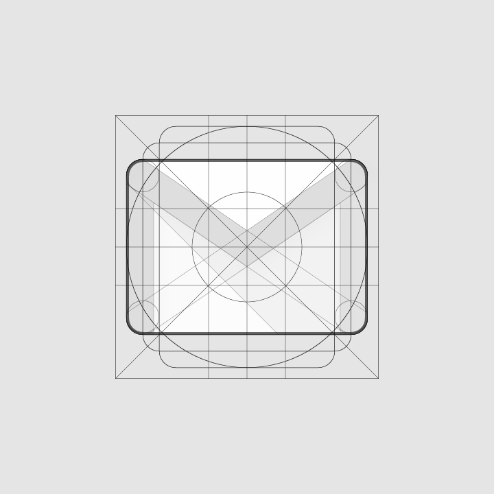
Keyline shapes are based on the grid. By using these core shapes as a baseline, you can maintain consistent visual proportions throughout your product icons.
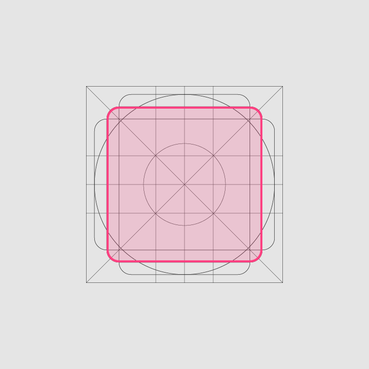
Height: 152dp
Width: 152dp
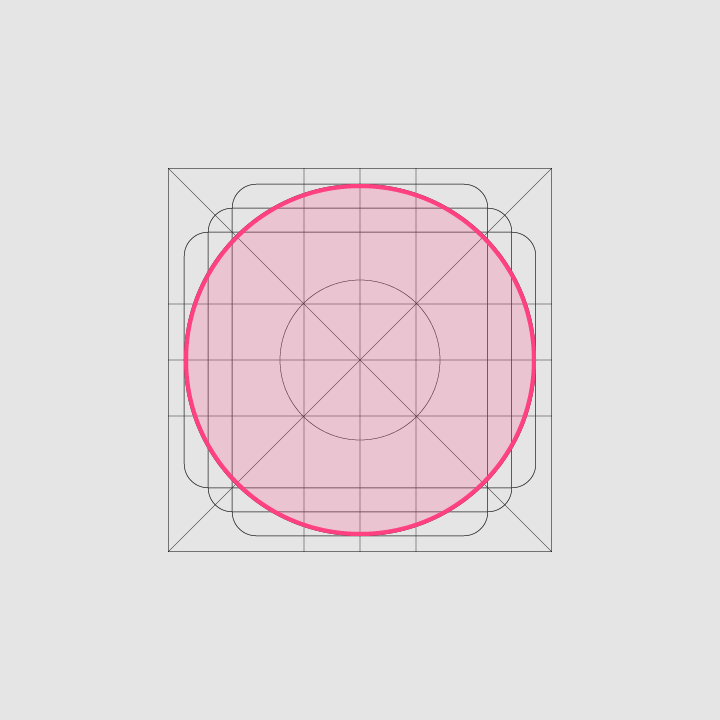
Diameter: 176dp
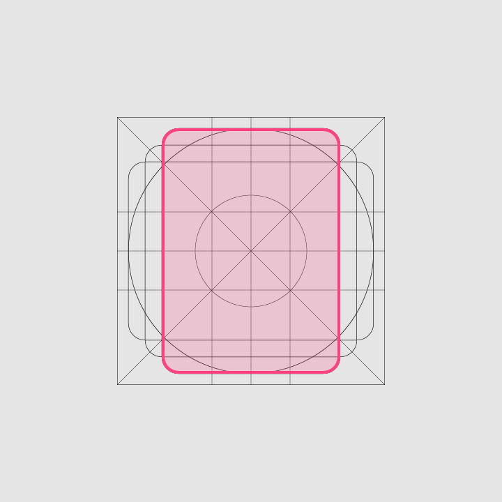
Height: 176dp
Width: 128dp
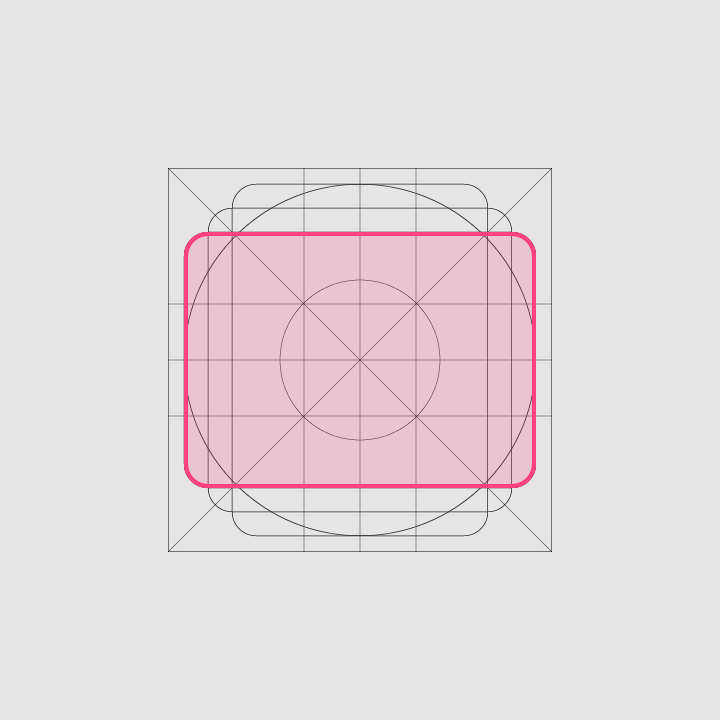
Height: 128dp
Width: 176dp
Geometry
These keyline shapes use preset standards: circle, square, rectangle, orthogonals, and diagonals. They unify product icons and maintain consistent placement on the grid.
Specs
Anatomy
To express a shared visual language, the graphic elements that make up a product icon should be consistent across all of a brand’s icons. Logos in particular should have characteristics that help establish familiarity across brand elements.
A product icon’s underlying structure positions each element in front of the previous one, such that each logo is designed from the bottom up.
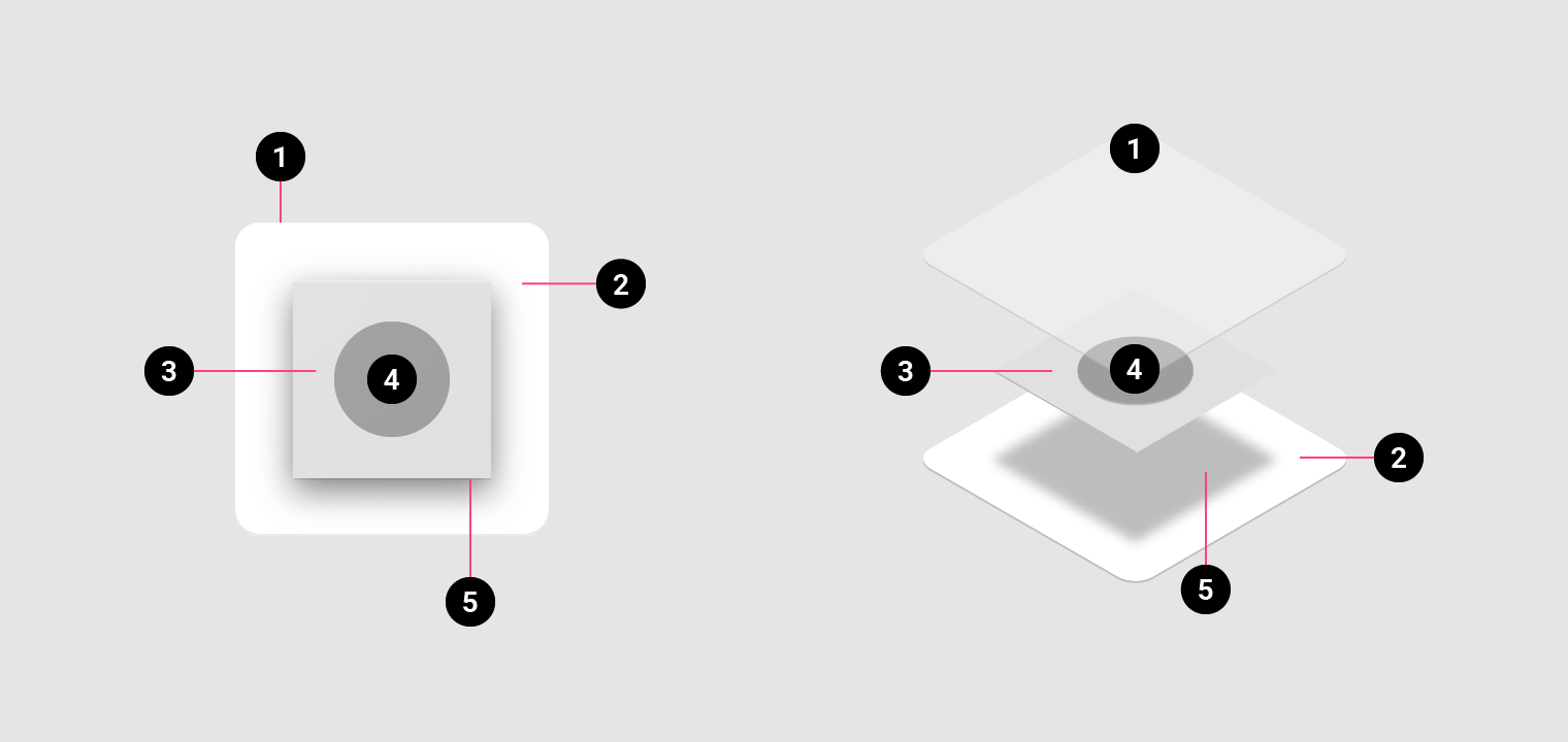
2. Material background
3. Material foreground
4. Color
5. Shadow
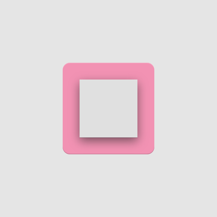
The furthest back layer of Material
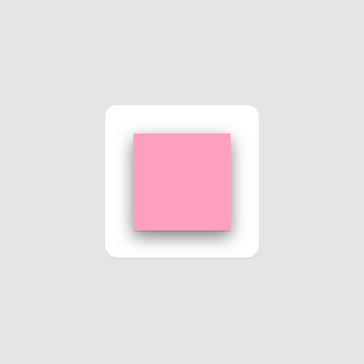
A layer of Material casts a shadow on the background
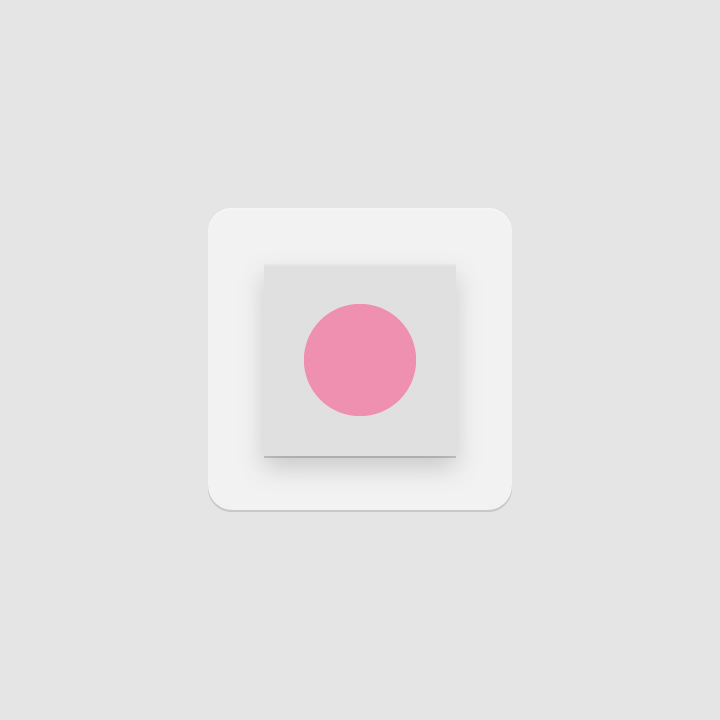
Color applied to a small portion of an element

Color applied to an entire element, edge-to-edge
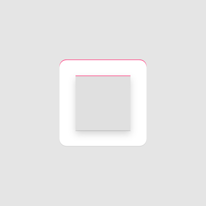
The top edge of a Material element is tinted (a lighter version of the original color)
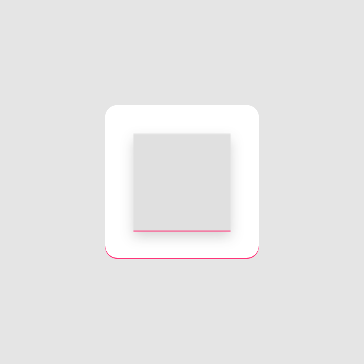
The bottom edge of a Material element is shaded (a darker version of the original color)
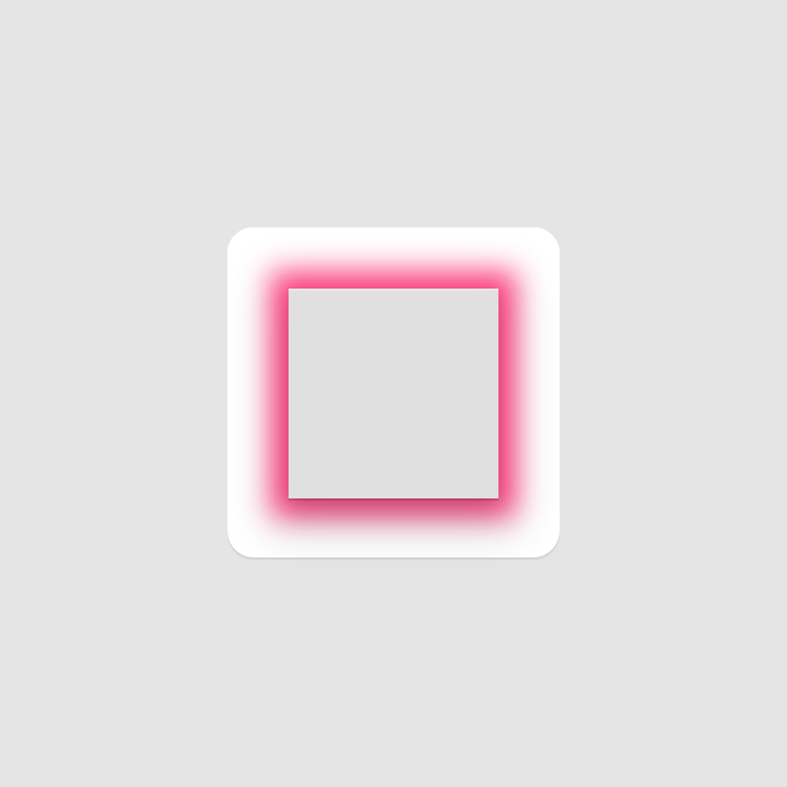
Contact shadow
A soft shadow around the edges of the foreground.
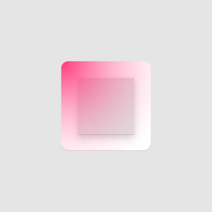
Finish
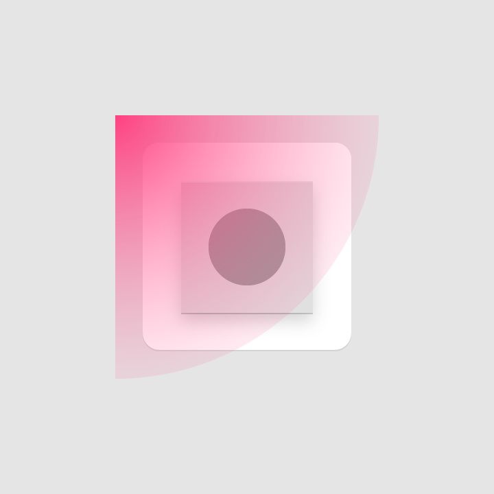
Surface lighting is a soft tint in front of all icon elements, fading from the upper left to lower right
Lighting
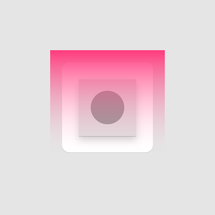
In the Material Design environment, virtual lights illuminate the scene and allow elements to cast shadows. Light is cast on the top of elements, creating a shadow that highlights the icon’s top and bottom edges. An angled light reinforces the sense of dimension across the elements.
Shadows
Contact shadow
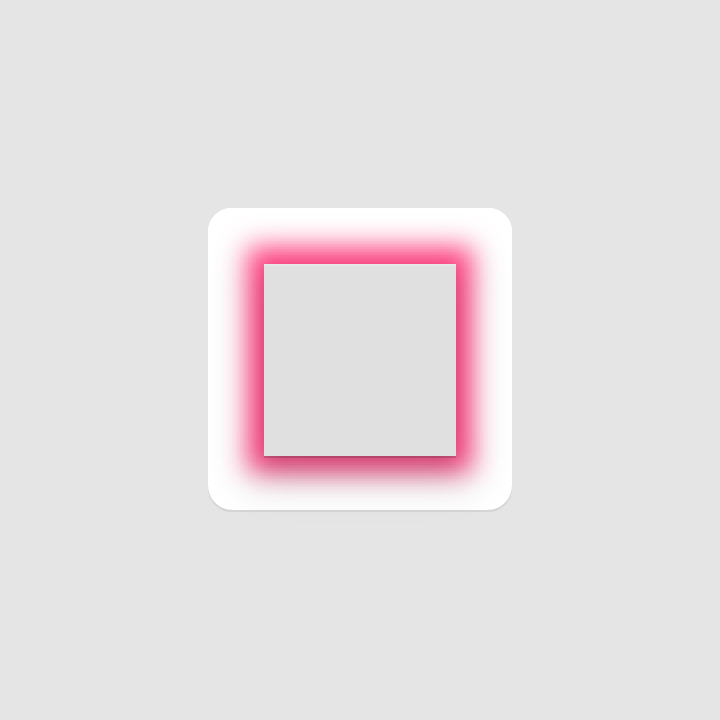
A contact shadow is a result of the virtual light from above. A soft shadow surrounds a Material element lightly on the top and left, and with slightly more emphasis below and to the right of the element. The shadow is contained within the icon’s background silhouette.
Drop shadow metrics
Mode: Normal
Opacity: 20%
X Offset: 4dp
Y Offset: 4dp
Y Offset: 4dp
Blur: 4dp
Color: Refer to Tint, shade and shadow values
Edge tint and shade
The top and bottom edges of Material elements provide a sense of depth, which is emphasized through edge tinting and shading:
- Tints highlight the top edge of an element (left, right, and bottom edges are not tinted)
- Shades darkens the bottom edge of an element (left, right, and top edges are not shaded)

Height: 1dp
Opacity: 20%
Color: White (#FFFFFF)

Shaded edge
Height: 1dp
Opacity: 20%
Color: Refer to tint, shade and shadow values
Finish
The finishing layer expresses the effect of Material Design’s virtual 45º light source. It extends from the top-left corner to the exterior edge of the icon’s silhouette.
Gradient metrics
Type: Radial
Angle: 45º
Color: White (#FFFFFF)
Midpoint Location: 33%
Slider 1
Opacity: 10%
Location: 0%
Slider 2
Opacity: 0%
Location: 100%

*Note the values outlined in this article are referenced from Adobe Illustrator.
Icon treatments
Color
Material elements have tactile surfaces. When combined with color, these surfaces can produce numerous unique combinations.
Color is flush with an element’s surface. Because color itself has no depth, it doesn’t contain edges or shadows.


Layer
When Material elements are layered, depth is produced by the shadows each layer casts. The number of surface layers that overlap should be limited, as too many layers can overcomplicate an icon.

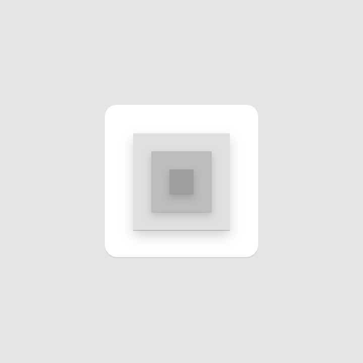
Don’t add too many layers.
Scoring
Scoring an icon creates the illusion of depth by dividing surfaces in half. Scores should be centered and placed on symmetrical shapes.


Don’t use multiple scores or position a score off-center.
Fold
When folded at multiple angles, Material elements have greater dimension.


Don’t use spot color on folded elements, to avoid altering or misrepresenting key elements.
Overlap
When Material elements overlap, it creates unique silhouettes. All elements, edges, and shadows are confined to the interior of the silhouette.


Don’t overlap more than two elements to avoid overcomplicating the icon.
Accordion
An accordion fold involves adjoining two Material elements with a connecting fold, adding dimension to an element.


Don’t exceed more than two accordion folds, as having too many complicates the icon and doesn’t provide a clear focal point.
Distort
Elements should remain in their geometric form and not be skewed, rotated, bowed, warped, or bent.

Don’t distort or transform product icons.

Source: https://material.io/design/iconography/product-icons.html

