Introduction to Flutter Widgets
Flutter has revolutionized the mobile app development landscape, offering developers a rich set of pre-designed, highly customizable widgets. These basic building blocks are instrumental in crafting intuitive and dynamic user interfaces. Flutter widgets, encapsulating both the look (UI) and behavior (UX) of an app, are renowned for their adaptability and efficiency.
If you have any question, feel free to contact us.
Exploring Core Widgets in Flutter
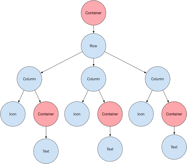
Flutter boasts a comprehensive library of core widgets, each designed to perform specific UI tasks with utmost efficiency. Widgets like Container, Row, Column, and GridView are fundamental in crafting visually appealing layouts.
Container
The Container widget is one of the most commonly used widgets in Flutter. It’s a box model that can contain other widgets and allows customization of dimensions, padding, margin, decoration, and more.
Example:
					Container(
  width: 150.0,
  height: 150.0,
  decoration: BoxDecoration(
    color: Colors.blue,
    borderRadius: BorderRadius.circular(12.0),
  ),
  child: Center(
    child: Text(
      'Hello, Travis!',
      style: TextStyle(color: Colors.white),
    ),
  ),
)
In this example, a Container widget is created with a width and height of 150.0 pixels. It has a blue background and rounded corners. Inside the Container, there is a Center widget containing a Text widget to display “Hello, Travis!”.
Row
The Row widget allows for the horizontal arrangement of other widgets.
Example:
					Row(
  mainAxisAlignment: MainAxisAlignment.spaceAround,
  children: <Widget>[
    Icon(Icons.home, size: 50, color: Colors.red),
    Icon(Icons.school, size: 50, color: Colors.green),
    Icon(Icons.work, size: 50, color: Colors.blue),
  ],
)
Here, a Row widget contains three Icon widgets. The icons are spaced around evenly in the horizontal direction using the mainAxisAlignment property.
Column
The Column widget allows for the vertical arrangement of other widgets.
Example:
					Column(
  mainAxisAlignment: MainAxisAlignment.center,
  children: <Widget>[
    Text('Hello'),
    Text('Travis'),
    Text('Tran'),
  ],
)
In this example, a Column widget contains three Text widgets. The texts are centered vertically using the mainAxisAlignment property.
GridView
The GridView widget is ideal for displaying a scrolling grid of elements.
Example:
					GridView.count(
  crossAxisCount: 2,
  children: List.generate(4, (index) {
    return Center(
      child: Text(
        'Item $index',
        style: Theme.of(context).textTheme.headline5,
      ),
    );
  }),
)
Here, a GridView widget with 2 columns is created using the GridView.count constructor. It uses the List.generate method to create four items in the grid. Each item is a Center widget containing a Text widget to display the item number.
Each of these core widgets plays a crucial role in building flexible and interactive UIs in Flutter, offering a wide range of customization options to meet specific design requirements.
Building Responsive Layouts with Flutter Widgets
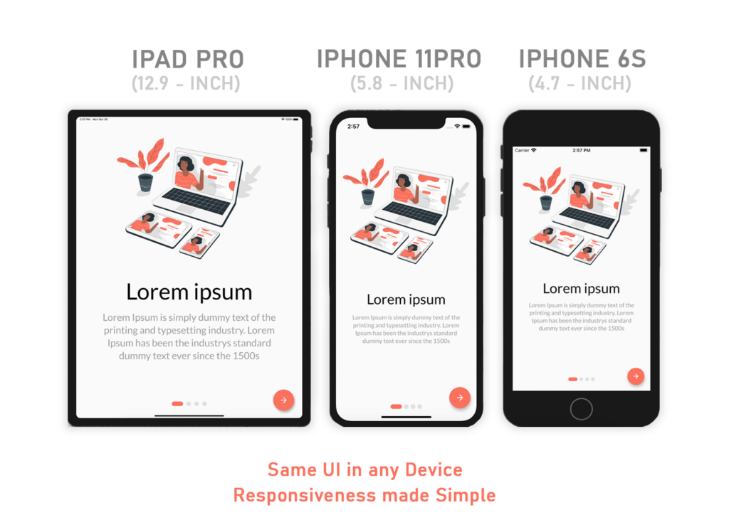
Creating responsive layouts is a breeze with Flutter, thanks to widgets like MediaQuery, OrientationBuilder, and LayoutBuilder.
MediaQuery
MediaQuery is used to retrieve the current media screen dimensions and characteristics to create responsive designs.
Example:
					double width = MediaQuery.of(context).size.width;

return Container(
  width: width,
  child: Text(
    'This container adjusts its width to the screen width.',
    style: TextStyle(fontSize: 20),
  ),
);
In this example, MediaQuery is used to get the current screen width, and the Container widget adjusts its width accordingly.
OrientationBuilder
OrientationBuilder widget helps to build a widget tree based on the parent widget’s orientation (landscape or portrait).
Example:
					OrientationBuilder(
  builder: (context, orientation) {
    return GridView.count(
      crossAxisCount: orientation == Orientation.portrait ? 2 : 4,
      children: List.generate(8, (index) {
        return Center(
          child: Text(
            'Item $index',
            style: Theme.of(context).textTheme.headline5,
          ),
        );
      }),
    );
  },
)
Here, the OrientationBuilder widget is used to change the number of columns in the GridView based on the screen’s orientation. It shows 2 columns in portrait mode and 4 columns in landscape mode.
LayoutBuilder
LayoutBuilder widget allows the widget tree to depend on the parent widget’s constraints, enabling responsive design based on different screen sizes.
Example:
					LayoutBuilder(
  builder: (context, constraints) {
    if (constraints.maxWidth > 600) {
      return WideLayout();
    } else {
      return NarrowLayout();
    }
  },
)
In this example, LayoutBuilder is used to choose between two different layouts (WideLayout and NarrowLayout) depending on the maximum width available to the widget. If the maximum width is greater than 600 pixels, it uses the WideLayout; otherwise, it uses the NarrowLayout.
These widgets are essential tools for Flutter developers to create responsive and adaptive UIs that offer a great user experience across a variety of devices with different screen sizes and orientations.
Creating Custom UI Components with Flutter Widgets
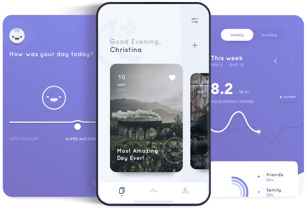
Flutter’s versatility shines in its capacity for customization. Developers can create bespoke UI components, tailoring widgets to fit specific needs. Custom widgets elevate user experience, offering unique, interactive elements that set applications apart. Examples of such ingenuity are plentiful, showcasing the framework’s adaptability and the creativity it unleashes in developers.
Custom Button
Creating a custom button with rounded corners, a gradient background, and an icon next to the text.
Example:
					RaisedButton(
  onPressed: () {},
  shape: RoundedRectangleBorder(borderRadius: BorderRadius.circular(30.0)),
  padding: EdgeInsets.all(0.0),
  child: Ink(
    decoration: BoxDecoration(
        gradient: LinearGradient(colors: [Colors.red, Colors.orange]),
        borderRadius: BorderRadius.circular(30.0)),
    child: Container(
      constraints: BoxConstraints(maxWidth: 300.0, minHeight: 50.0),
      alignment: Alignment.center,
      child: Row(
        mainAxisAlignment: MainAxisAlignment.spaceEvenly,
        children: <Widget>[
          Icon(Icons.send, color: Colors.white),
          Text("Send", textAlign: TextAlign.center, style: TextStyle(color: Colors.white)),
        ],
      ),
    ),
  ),
)
This example demonstrates a custom RaisedButton with a linear gradient background, rounded corners, an icon, and text.
Custom Card
Creating a custom card with an image, title, and a button.
Example:
					Card(
  clipBehavior: Clip.antiAlias,
  shape: RoundedRectangleBorder(borderRadius: BorderRadius.circular(15.0)),
  child: Column(
    children: <Widget>[
      Image.network(
        'https://example.com/image.jpg',
        height: 150,
        fit: BoxFit.cover,
      ),
      Padding(
        padding: EdgeInsets.all(10.0),
        child: Text(
          'Custom Card',
          style: TextStyle(fontSize: 20, fontWeight: FontWeight.bold),
        ),
      ),
      ButtonBar(
        children: <Widget>[
          FlatButton(
            onPressed: () {},
            child: Text('VIEW'),
          ),
        ],
      ),
    ],
  ),
)
In this example, a custom Card widget contains an image, text, and a button. The card has rounded corners, and the image is clipped to fit within those rounded corners.
Custom AppBar
Creating a custom AppBar with a search bar.
Example:
					AppBar(
  title: TextField(
    decoration: InputDecoration(
      hintText: 'Search...',
      filled: true,
      fillColor: Colors.white,
      border: OutlineInputBorder(
        borderRadius: BorderRadius.circular(15.0),
        borderSide: BorderSide.none,
      ),
    ),
  ),
  actions: <Widget>[
    IconButton(
      icon: Icon(Icons.search),
      onPressed: () {},
    ),
  ],
)
This example shows a custom AppBar containing a TextField for search functionality and a search icon button.
Each of these examples demonstrates how you can combine and customize existing Flutter widgets to create custom UI components tailored to your specific needs, enhancing both the functionality and aesthetics of your applications.
Advanced Techniques for Dynamic UI Design
Flutter’s powerful animation system breathes life into UI, making applications visually engaging and interactive. Multimedia elements can be seamlessly integrated, enhancing aesthetics and functionality. These advanced techniques ensure that apps are not just functional but are experiences that captivate users, encouraging prolonged engagement.
Integrating Multimedia Elements
Incorporating images, audio, and video can greatly enhance the user experience. Here’s an example of integrating an image from the network.
Example:
					Image.network(
  'https://example.com/myimage.jpg',
  fit: BoxFit.cover,
)
This code snippet demonstrates how to display an image from the internet using the Image.network widget, with the fit property ensuring the image covers the entire allocated space while maintaining its aspect ratio.
Flutter’s Animation System
Flutter’s animation system is powerful and allows developers to create visually appealing dynamic interfaces. Here’s an example of a simple fade-in animation using the AnimatedOpacity widget.
Example:
					AnimatedOpacity(
  opacity: _visible ? 1.0 : 0.0,
  duration: Duration(seconds: 2),
  child: Container(
    width: 100.0,
    height: 100.0,
    color: Colors.blue,
    child: Center(
      child: Text('Fade In/Out', style: TextStyle(color: Colors.white)),
    ),
  ),
)
In this example, the AnimatedOpacity widget is used to create a fade-in/out effect for a Container widget. The _visible variable is a boolean that can be toggled to fade the Container in or out over a duration of 2 seconds.
Custom Animations with AnimationController
For more control over animations, you can use AnimationController. Here’s an example of rotating a widget using AnimationController.
Example:
					AnimationController _controller;

_controller = AnimationController(
  duration: const Duration(seconds: 5),
  vsync: this,
)..repeat();

Transform.rotate(
  angle: _controller.value * 2.0 * math.pi,
  child: Container(
    width: 100.0,
    height: 100.0,
    color: Colors.green,
    child: Center(
      child: Text('Rotating', style: TextStyle(color: Colors.white)),
    ),
  ),
)
In this example, AnimationController is used to create a custom rotation animation for a Container widget. The Transform.rotate widget is used to rotate the Container as the _controller‘s value changes.
These advanced techniques allow developers to create dynamic, interactive, and visually appealing user interfaces in Flutter applications, ensuring a captivating user experience. Make sure to import the dart:math library to use math.pi in the rotation example. Also, the vsync parameter in the AnimationController should be a TickerProvider, typically your widget class should mix in SingleTickerProviderStateMixin or TickerProviderStateMixin depending on the number of AnimationController objects you have.
Conclusion
In essence, Flutter widgets are the cornerstone of creating dynamic, interactive user interfaces. Their versatility, efficiency, and ease of use make them a favorite among developers. As we continue to push the boundaries of digital innovation, the exploration and mastery of Flutter widgets remain pivotal. The journey into the intricate world of Flutter widgets promises not just enhanced skills for developers but enriched experiences for users.
FAQs
Flutter widgets are the core building blocks of UI development in Flutter, allowing for the creation of intuitive and dynamic interfaces.
They offer a range of customization and adaptability options, enabling developers to create responsive and interactive UIs efficiently.
Absolutely, Flutter allows for extensive customization, enabling the creation of bespoke UI components tailored to specific needs.
Utilize widgets like MediaQuery, OrientationBuilder, and LayoutBuilder to create layouts that adapt seamlessly to various screen sizes and orientations.

